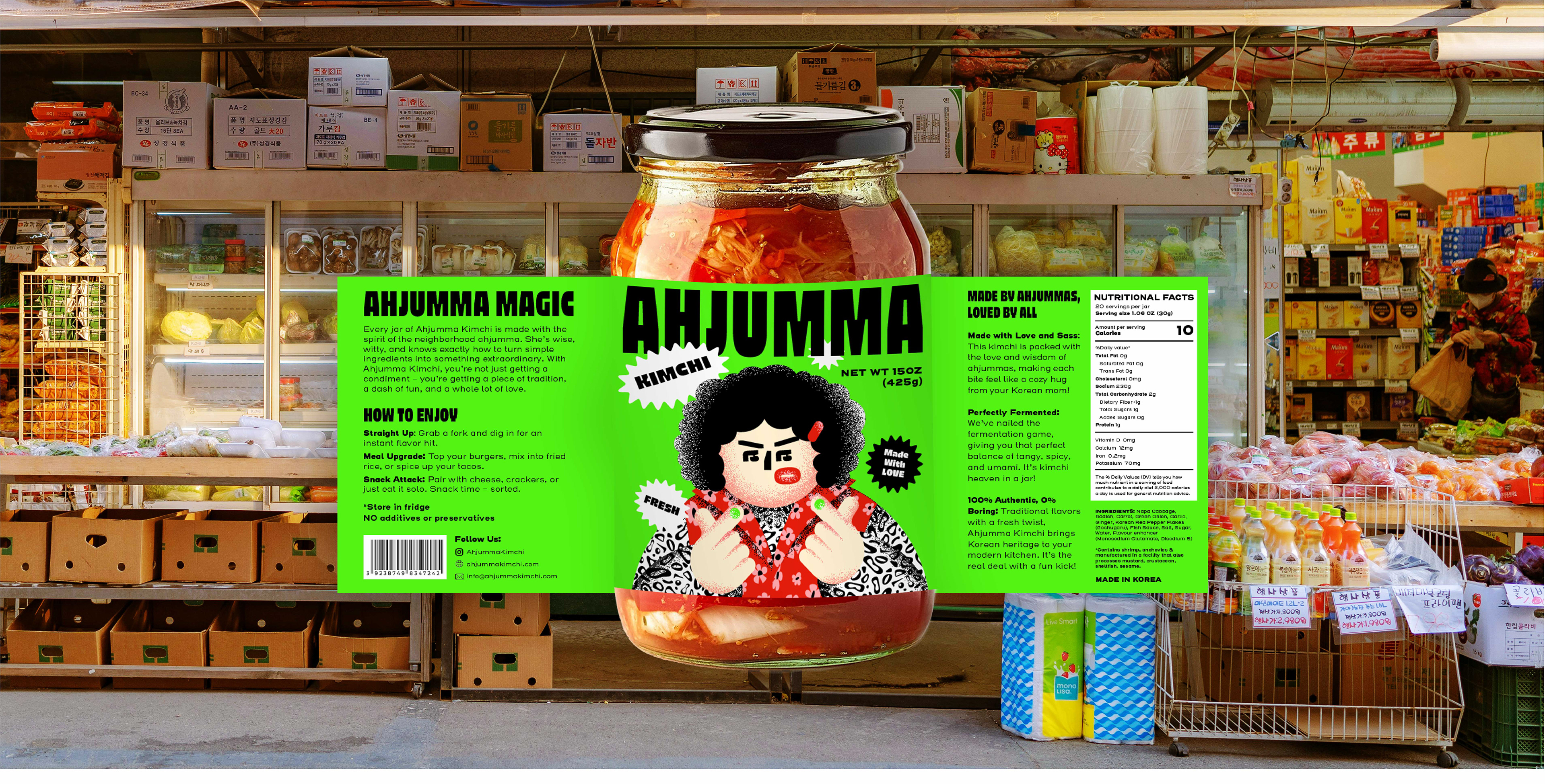
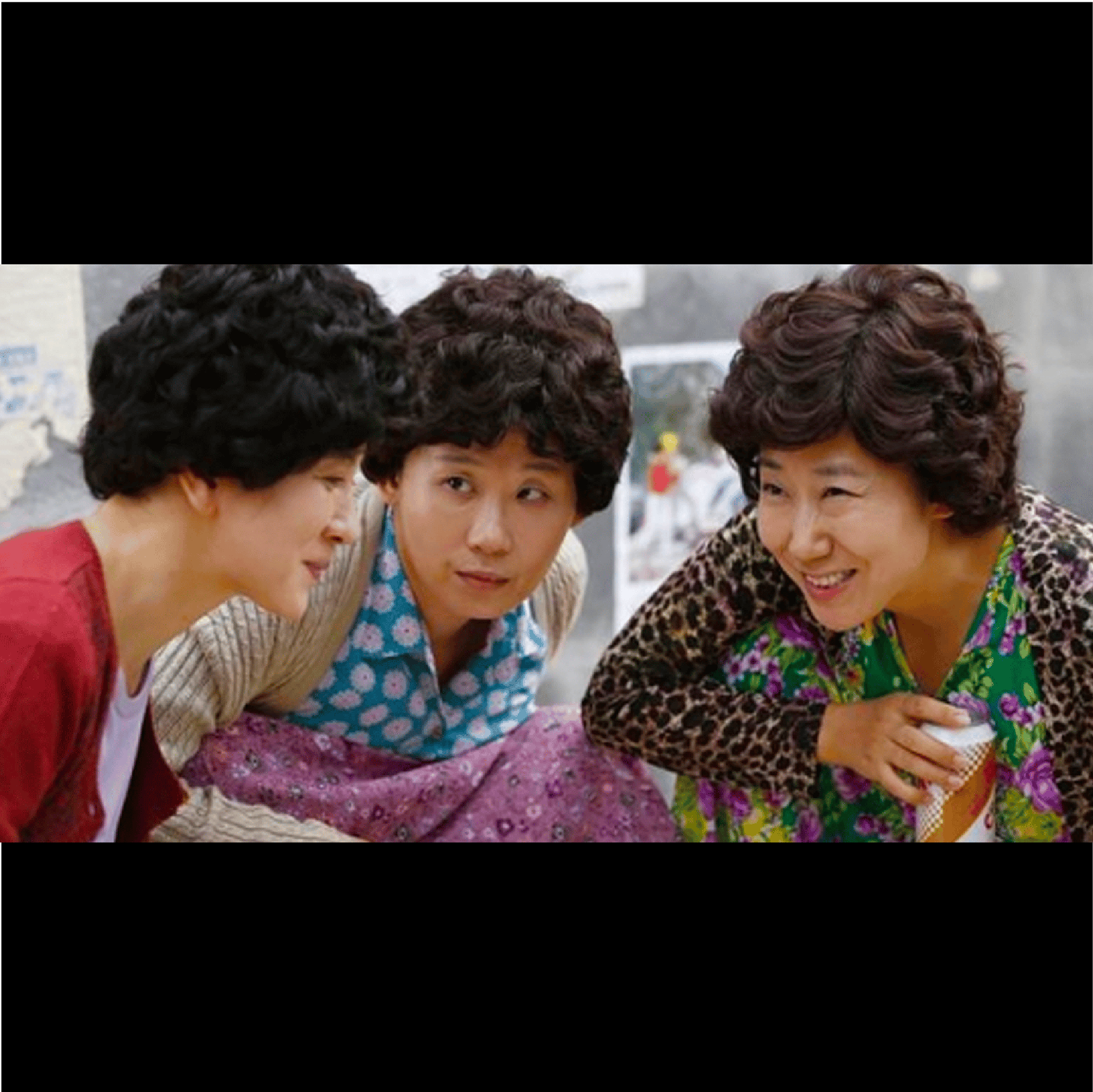
Ahjumma is a Korean term referring to those chatty aunties you'd catch around the neighborhood or at the markets. They're sassy, bold and spicy just like the kimchi they make. They bring the heat and know how to whip up a delicious meal. Their spirit, boldness and charm are embodied in this jar of kimchi, a staple food in every Korean household like how their presence adds a flare to life.
Art Direction & Concept Art: Nhi Pham
Graphic Designer: Nhi Pham
Packaging Design | Illustration | Concept Art
The Logo
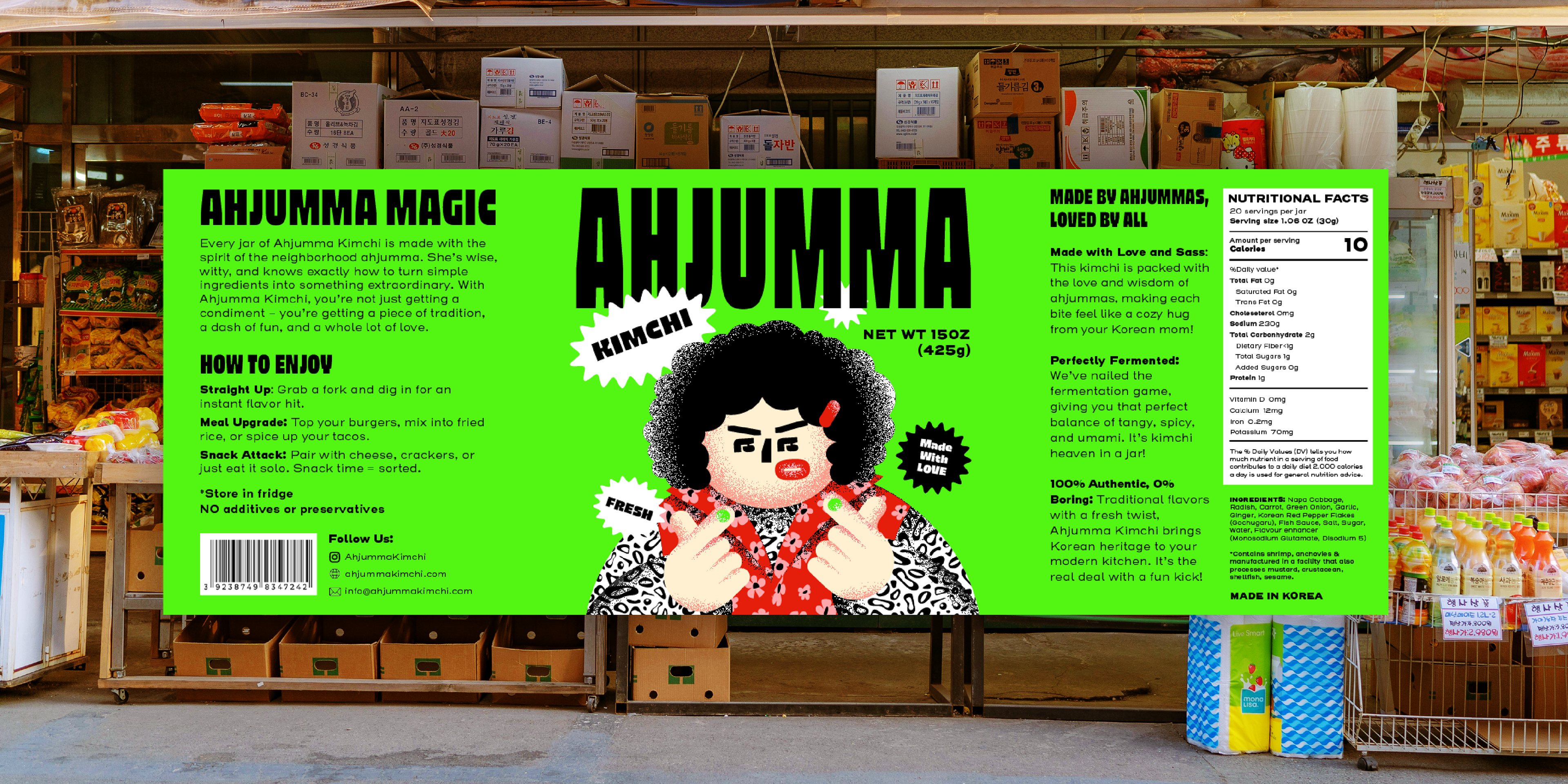
The logo is bold and direct, immediately communicating the brand's confident personality. I chose a stylized font that balances playfulness with strength—its roundness reference the iconic permed hairstyle associated with ahjummas, while its heavy weight conveys both their attitude and kimchi's punchy, robust flavor.
Ahjumma(n)
The Korean term for a middle-aged woman, usually refers to any married woman, but is generally used for women over 40. To both Koreans and foreigners over here, the word ahjumma is embedded with stereotypical images of plump, aggressive old women with permed hair and baggy clothes who elbow you roughly to get a seat on the train or to push in front of you at the shops.
They are at once completely irritating, yet also very endearing. They can be incredibly friendly, genuinely helpful and cook brilliantly - even if the service is gruff and hurried. Of course, as a stereotype, many older Korean women are nothing like this limited but useful definition.
The Illustration
The signature character brings the brand to life, embodying the classic ahjumma aesthetic—curly permed hair, floral vest, and bold patterned clothing. Her face is cleverly constructed from the same typeface used in the logo, maintaining brand consistency while transforming letterforms into expressive facial features. The signature Korean finger heart gesture adds cultural authenticity and pop culture appeal, creating a character that's both traditional and
contemporary—just like the brand itself.
contemporary—just like the brand itself.
The Packaging
Combining all brand elements including logo, modern and clean typeface and illustration to create a unique one of a kind packaging for Ahjumma Kimchi
The Colors
Green
Represents the fresh ingredients at the heart of kimchi—napa cabbage, green onions, mustard greens, cucumbers, and radishes—capturing the product in its pre-fermented state.
Red
Reflects kimchi's vibrant color after fermentation, created by gochugaru (Korean chili flakes) and gochujang (chili paste). This bold hue conveys the spicy, punchy flavor that defines the product.
Black
References the dark hair and eyes common among Koreans, grounding the brand in East Asian beauty and culture while reinforcing the mascot's authentic representation.
Motion Design
Animated variations of the brand mascot and logo elements bring energy to digital platforms, creating versatile assets for social media, web, and marketing campaigns.
Animation with brand's tagline
Ahjumma Kimchi Design Process Reel